Logistic Regression 04 Apr 2019
This notebook helps us to introduce how to train a Logistic Regression model for binary classificacion and multiclass classification. We will use the “wine” dataset provided by the Scikit-learn library.
Initial Setup
This cell contains code for referring the common imports that we will be using through this notebook.
# Common imports
import numpy as np

# to make this notebook's output stable across runs
np.random.seed(10)

# To plot pretty figures
import matplotlib as mpl
import matplotlib.pyplot as plt
mpl.rc('axes', labelsize=14)
mpl.rc('xtick', labelsize=12)
mpl.rc('ytick', labelsize=12)
Logistic Function
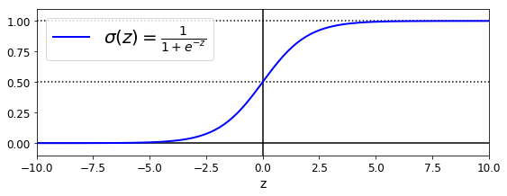
Firs, let’s explore the logistic function. As we see in the following plot, the logistic function output is in the range of [0,1]. This feature is particular important when one looks for a function that calculates the probability. See that when the value of z is greater than 5, the function output is roughly 1. Cuando z is smaller than -5, the function output is roughly -1. This function shows simmetry, that is, sigma(z) = sigma(-z).
We will use this function to calculate the probality for a binary classification task. That is, sigma(z) will be the probability that the sample belongs to class 1.
z = np.linspace(-10, 10, 100)
sig = 1 / (1 + np.exp(-z))
plt.figure(figsize=(9, 3))
plt.plot([-10, 10], [0, 0], "k-")
plt.plot([-10, 10], [0.5, 0.5], "k:")
plt.plot([-10, 10], [1, 1], "k:")
plt.plot([0, 0], [-1.1, 1.1], "k-")
plt.plot(z, sig, "b-", linewidth=2, label=r"$\sigma(z) = \frac{1}{1 + e^{-z}}$")
plt.xlabel("z")
plt.legend(loc="upper left", fontsize=20)
plt.axis([-10, 10, -0.1, 1.1])
plt.show()
Load Data
As we have mentioned, we will be using the wine dataset. Let’s load this dataset and show its description.
from sklearn import datasets
wine = datasets.load_wine()
list(wine.keys())
['data', 'target', 'target_names', 'DESCR', 'feature_names']
print(wine.DESCR)
.. _wine_dataset:

Wine recognition dataset
------------------------

**Data Set Characteristics:**

    :Number of Instances: 178 (50 in each of three classes)
    :Number of Attributes: 13 numeric, predictive attributes and the class
    :Attribute Information:
 		- Alcohol
 		- Malic acid
 		- Ash
		- Alcalinity of ash
 		- Magnesium
		- Total phenols
 		- Flavanoids
 		- Nonflavanoid phenols
 		- Proanthocyanins
		- Color intensity
 		- Hue
 		- OD280/OD315 of diluted wines
 		- Proline

    - class:
            - class_0
            - class_1
            - class_2

    :Summary Statistics:

    ============================= ==== ===== ======= =====
                                   Min   Max   Mean     SD
    ============================= ==== ===== ======= =====
    Alcohol:                      11.0  14.8    13.0   0.8
    Malic Acid:                   0.74  5.80    2.34  1.12
    Ash:                          1.36  3.23    2.36  0.27
    Alcalinity of Ash:            10.6  30.0    19.5   3.3
    Magnesium:                    70.0 162.0    99.7  14.3
    Total Phenols:                0.98  3.88    2.29  0.63
    Flavanoids:                   0.34  5.08    2.03  1.00
    Nonflavanoid Phenols:         0.13  0.66    0.36  0.12
    Proanthocyanins:              0.41  3.58    1.59  0.57
    Colour Intensity:              1.3  13.0     5.1   2.3
    Hue:                          0.48  1.71    0.96  0.23
    OD280/OD315 of diluted wines: 1.27  4.00    2.61  0.71
    Proline:                       278  1680     746   315
    ============================= ==== ===== ======= =====

    :Missing Attribute Values: None
    :Class Distribution: class_0 (59), class_1 (71), class_2 (48)
    :Creator: R.A. Fisher
    :Donor: Michael Marshall (MARSHALL%PLU@io.arc.nasa.gov)
    :Date: July, 1988

This is a copy of UCI ML Wine recognition datasets.
https://archive.ics.uci.edu/ml/machine-learning-databases/wine/wine.data

The data is the results of a chemical analysis of wines grown in the same
region in Italy by three different cultivators. There are thirteen different
measurements taken for different constituents found in the three types of
wine.

Original Owners:

Forina, M. et al, PARVUS -
An Extendible Package for Data Exploration, Classification and Correlation.
Institute of Pharmaceutical and Food Analysis and Technologies,
Via Brigata Salerno, 16147 Genoa, Italy.

Citation:

Lichman, M. (2013). UCI Machine Learning Repository
[http://archive.ics.uci.edu/ml]. Irvine, CA: University of California,
School of Information and Computer Science.

.. topic:: References

  (1) S. Aeberhard, D. Coomans and O. de Vel,
  Comparison of Classifiers in High Dimensional Settings,
  Tech. Rep. no. 92-02, (1992), Dept. of Computer Science and Dept. of
  Mathematics and Statistics, James Cook University of North Queensland.
  (Also submitted to Technometrics).

  The data was used with many others for comparing various
  classifiers. The classes are separable, though only RDA
  has achieved 100% correct classification.
  (RDA : 100%, QDA 99.4%, LDA 98.9%, 1NN 96.1% (z-transformed data))
  (All results using the leave-one-out technique)

  (2) S. Aeberhard, D. Coomans and O. de Vel,
  "THE CLASSIFICATION PERFORMANCE OF RDA"
  Tech. Rep. no. 92-01, (1992), Dept. of Computer Science and Dept. of
  Mathematics and Statistics, James Cook University of North Queensland.
  (Also submitted to Journal of Chemometrics).
Binary Classification with one Feature
As we see, our wine dataset has a classification among 3 classes(class_0, class_1, class_2). Also, it contains 13 features from the “Alcohol” to the “Proline” feature. Since our first task is to work on a binary classification, we define a binary classification task as predicting if the class is class_1 or not. In addition, for simplification purposes, we first pick up just one feature, the “Color Intensity” feature.
X = wine["data"][:, 9].reshape(-1,1)  # Colour Intensity
y = (wine["target"] == 1).astype(np.int)  # 1 if class_1, else 0
Now that we have our input X and output y, we can train a LogisticRegression model.
from sklearn.linear_model import LogisticRegression
log_reg = LogisticRegression(solver="liblinear", random_state=10)
log_reg.fit(X, y)
LogisticRegression(C=1.0, class_weight=None, dual=False, fit_intercept=True,
          intercept_scaling=1, max_iter=100, multi_class='warn',
          n_jobs=None, penalty='l2', random_state=10, solver='liblinear',
          tol=0.0001, verbose=0, warm_start=False)
Once the model has been fitted, we can make predictions for new data. Let’s simulate new data for plotting purposes.
X_new = np.linspace(0, 10, 1000).reshape(-1, 1)
y_proba = log_reg.predict_proba(X_new)

plt.plot(X_new, y_proba[:, 1], "g-", linewidth=2, label="class_1")
plt.plot(X_new, y_proba[:, 0], "b--", linewidth=2, label="Non-class_1")
[<matplotlib.lines.Line2D at 0x2dcca7dd7b8>]
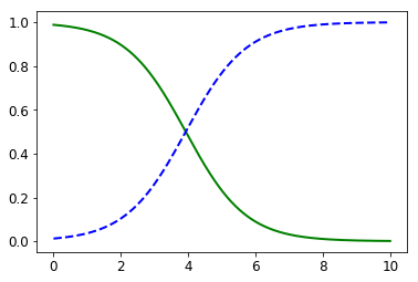
This plot is showing that whenever the “Colour Intensity” feature is smaller than 3.93, it is more likely that the sample belongs to class_1. On the other hand, whenever this featue is greater than 3.93, it is more likely that the sample do not belong to class_1.
X_new = np.linspace(0, 10, 1000).reshape(-1, 1)
y_proba = log_reg.predict_proba(X_new)
decision_boundary = X_new[y_proba[:, 1] <= 0.5][0]

plt.figure(figsize=(8, 3))
plt.plot(X[y==0], y[y==0], "bs")
plt.plot(X[y==1], y[y==1], "g^")
plt.plot([decision_boundary, decision_boundary], [-1, 2], "k:", linewidth=2)
plt.plot(X_new, y_proba[:, 1], "g-", linewidth=2, label="class_1")
plt.plot(X_new, y_proba[:, 0], "b--", linewidth=2, label="Non-class_1")
plt.text(decision_boundary+0.02, 0.15, "Decision  boundary", fontsize=14, color="k", ha="center")
plt.arrow(decision_boundary, 0.08, +0.3, 0, head_width=0.05, head_length=0.1, fc='b', ec='b')
plt.arrow(decision_boundary, 0.92, -0.3, 0, head_width=0.05, head_length=0.1, fc='g', ec='g')
plt.xlabel("Colour Intensity", fontsize=14)
plt.ylabel("Probability", fontsize=14)
plt.legend(loc="center right", fontsize=14)
plt.axis([0, 10, -0.02, 1.02])
plt.show()
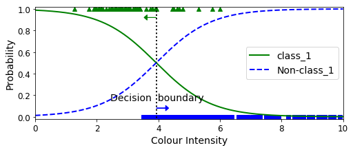
decision_boundary
array([3.93393393])
log_reg.predict([[3.8], [4.0]])
array([1, 0])
Binary Classification with two Features
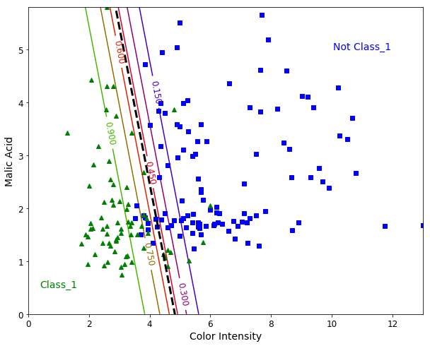
Let’s add a second feature to our model. We pick up the “Malic Acid” feature. The steps are similar, but now we are able to plot a “Hyperplane” (a line when we use two features). This hyperplane can be interpreted as the decision boundary between the two classes.
from sklearn.linear_model import LogisticRegression

X = wine["data"][:, (9, 1)]  # Color intensity,  Malic acid
y = (wine["target"] == 1).astype(np.int)

log_reg = LogisticRegression(solver="liblinear", C=1000, random_state=10)
log_reg.fit(X, y)

x0, x1 = np.meshgrid(
        np.linspace(0, 13, 500).reshape(-1, 1),
        np.linspace(0, 5.80, 200).reshape(-1, 1),
    )
X_new = np.c_[x0.ravel(), x1.ravel()]

y_proba = log_reg.predict_proba(X_new)

plt.figure(figsize=(10, 8))
plt.plot(X[y==0, 0], X[y==0, 1], "bs")
plt.plot(X[y==1, 0], X[y==1, 1], "g^")

zz = y_proba[:, 1].reshape(x0.shape)
contour = plt.contour(x0, x1, zz, cmap=plt.cm.brg)


left_right = np.array([2.9, 7])
boundary = -(log_reg.coef_[0][0] * left_right + log_reg.intercept_[0]) / log_reg.coef_[0][1]

plt.clabel(contour, inline=1, fontsize=12)
plt.plot(left_right, boundary, "k--", linewidth=3)
plt.text(11, 5, "Not Class_1", fontsize=14, color="b", ha="center")
plt.text(1, 0.5, "Class_1", fontsize=14, color="g", ha="center")
plt.xlabel("Color Intensity", fontsize=14)
plt.ylabel("Malic Acid", fontsize=14)
plt.axis([0, 13, 0.0, 5.80])
plt.show()
Multiclass Classification
Since our dataset has three classes, we might train a model to predict the probability of a sample for each of three classes.
X = wine["data"][:, (9, 1)]  # Color intensity,  Malic acid
y = wine["target"]

softmax_reg = LogisticRegression(multi_class="multinomial",solver="lbfgs", C=10, random_state=10)
softmax_reg.fit(X, y)
LogisticRegression(C=10, class_weight=None, dual=False, fit_intercept=True,
          intercept_scaling=1, max_iter=100, multi_class='multinomial',
          n_jobs=None, penalty='l2', random_state=10, solver='lbfgs',
          tol=0.0001, verbose=0, warm_start=False)
x0, x1 = np.meshgrid(
        np.linspace(0, 13, 500).reshape(-1, 1),
        np.linspace(0, 5.80, 200).reshape(-1, 1),
    )

X_new = np.c_[x0.ravel(), x1.ravel()]


y_proba = softmax_reg.predict_proba(X_new)
y_predict = softmax_reg.predict(X_new)

zz1 = y_proba[:, 0].reshape(x0.shape)
zz = y_predict.reshape(x0.shape)

plt.figure(figsize=(10, 6))
plt.plot(X[y==2, 0], X[y==2, 1], "g^", label="Class_2")
plt.plot(X[y==1, 0], X[y==1, 1], "bs", label="Class_1")
plt.plot(X[y==0, 0], X[y==0, 1], "yo", label="Class_0")

from matplotlib.colors import ListedColormap
custom_cmap = ListedColormap(['#fafab0','#9898ff','#a0faa0'])

plt.contourf(x0, x1, zz, cmap=custom_cmap)
contour = plt.contour(x0, x1, zz1, cmap=plt.cm.brg)
plt.clabel(contour, inline=1, fontsize=12)
plt.xlabel("Color Intensity", fontsize=14)
plt.ylabel("Malic Acid", fontsize=14)
plt.legend(loc="upper right", fontsize=14)
plt.axis([0, 13, 0, 5.8])
plt.show()
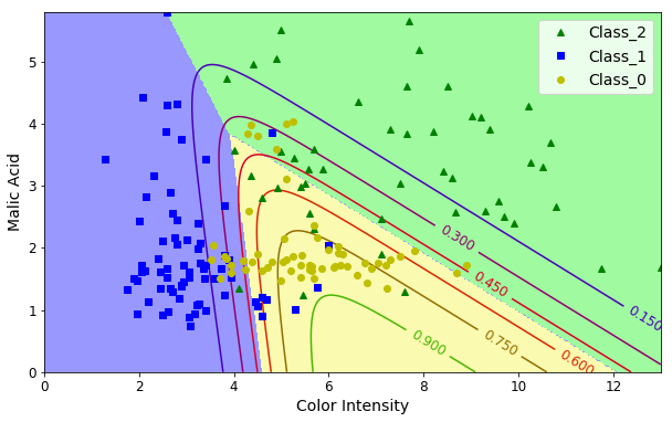
softmax_reg.predict([[8, 2]])
array([2])
softmax_reg.predict_proba([[8, 2]])
array([[4.71893324e-01, 1.61515664e-04, 5.27945161e-01]])
Out of scope
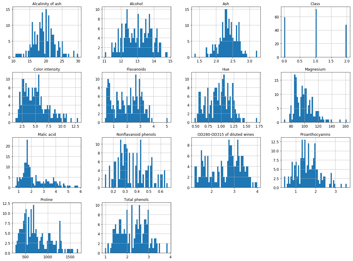
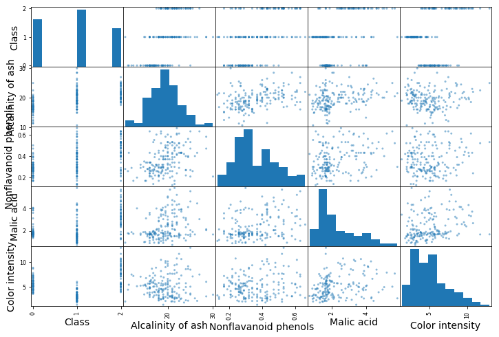
We used the following cells to evaluate the data and identify which two features are candidates for the previous task.
import pandas as pd
columns=list(['Alcohol', 'Malic acid', 'Ash',
                                'Alcalinity of ash', 'Magnesium',
                                'Total phenols', 'Flavanoids',
                                'Nonflavanoid phenols', 'Proanthocyanins',
                                'Color intensity', 'Hue',
                                'OD280-OD315 of diluted wines',
                                'Proline', 'Class'])
df = pd.DataFrame(Xy, columns=columns)
df.head()
| Alcohol | Malic acid | Ash | Alcalinity of ash | Magnesium | Total phenols | Flavanoids | Nonflavanoid phenols | Proanthocyanins | Color intensity | Hue | OD280-OD315 of diluted wines | Proline | Class | |
|---|---|---|---|---|---|---|---|---|---|---|---|---|---|---|
| 0 | 14.23 | 1.71 | 2.43 | 15.6 | 127.0 | 2.80 | 3.06 | 0.28 | 2.29 | 5.64 | 1.04 | 3.92 | 1065.0 | 0.0 |
| 1 | 13.20 | 1.78 | 2.14 | 11.2 | 100.0 | 2.65 | 2.76 | 0.26 | 1.28 | 4.38 | 1.05 | 3.40 | 1050.0 | 0.0 |
| 2 | 13.16 | 2.36 | 2.67 | 18.6 | 101.0 | 2.80 | 3.24 | 0.30 | 2.81 | 5.68 | 1.03 | 3.17 | 1185.0 | 0.0 |
| 3 | 14.37 | 1.95 | 2.50 | 16.8 | 113.0 | 3.85 | 3.49 | 0.24 | 2.18 | 7.80 | 0.86 | 3.45 | 1480.0 | 0.0 |
| 4 | 13.24 | 2.59 | 2.87 | 21.0 | 118.0 | 2.80 | 2.69 | 0.39 | 1.82 | 4.32 | 1.04 | 2.93 | 735.0 | 0.0 |
import matplotlib.pyplot as plt
df.hist(bins=50, figsize=(20,15))
plt.show()
corr_matrix = df.corr()
corr_matrix['Class'].sort_values(ascending=False)
Class                           1.000000
Alcalinity of ash               0.517859
Nonflavanoid phenols            0.489109
Malic acid                      0.437776
Color intensity                 0.265668
Ash                            -0.049643
Magnesium                      -0.209179
Alcohol                        -0.328222
Proanthocyanins                -0.499130
Hue                            -0.617369
Proline                        -0.633717
Total phenols                  -0.719163
OD280-OD315 of diluted wines   -0.788230
Flavanoids                     -0.847498
Name: Class, dtype: float64
from pandas.plotting import scatter_matrix

attributes = ["Class", "Alcalinity of ash", "Nonflavanoid phenols","Malic acid", "Color intensity"]
fig = scatter_matrix(df[attributes], figsize=(12, 8))
References
Hands-On Machine Learning with Scikit-Learn and TensorFlow: Concepts, Tools, and Techniques to Build Intelligent Systems